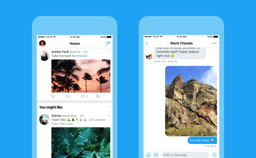
Twitter’s big design update starting rolling out yesterday morning, followed shortly by the traditional cries for Jack Dorsey’s head.
It’s a major redesign. The update makes the Twitter app cleaner and easier to read, and provides live updates to threads. Headers are bolded, and subtle changes to icons make for a much more contemporary look. They also changed the shape of the profile pictures from squares to circles.
Who’s Working This Weekend?
And so it was that yesterday morning graphic designers across the world felt a shift in the Universe, as though a million brands suddenly cried out in need of them. Anyone with a logo optimized to fit the Twitter square has had its corners chopped off, to various effects.
![]()
![]()
If you have a SnapChat code as your icon, it’s broken now. I tested a few, and enough has been cut off that the app can’t recognize it.

A Symbol Most Know and Love
Twitter has done a bit of rearranging in the mobile app, as well. The ‘Me’ icon at the bottom has been removed, and you can now access your profile, settings, etc., in a sidebar you swipe to open.
According to Twitter’s blog, people unfamiliar with Twitter tended to think the Reply button was a Delete button, so that has been switched out for a chat bubble. Twitter describes the chat bubble icon as, “a symbol most know and love.”
I haven’t seen this in action yet, but supposedly you can watch the numbers for replies, retweets, and likes happen in real time. I can see this being satisfying for anyone obsessed with their stats.
What is Happening? Where Are We?
There was a lot of initial confusion about the roll-out. Many people reported downloading an update that did not alter the app’s appearance. Later in the day, those same people said that the app had changed, and they communicated their feelings with various gifs.
Looking around #NewTwitter today like pic.twitter.com/io2izvgdQ8
— The Walking Dead (@TheWalkingDead) June 15, 2017
Reactions ranged from “Ooh, circles!” to “Why haven’t you destroyed all the bots and thrown the One Ring into Mount Doom yet?” The latter is a valid question, which Twitter addressed in a vague sort of way on their blog the day before this update.
People Want A Troll Killer
Jack Dorsey announced the design update in a tweet that has been flooded with replies from frustrated users who want a solution to the infestation of bots and Nazis. People who are still getting death threats on a daily basis remain unmoved by the ‘seamless interaction’ of the lighter icons.
While the blog on fighting abuse had few details, Twitter did state that they “have been doubling down on our efforts here, expanding our team and resources, and building new tools and processes.” Twitter says that they are hunting down spam accounts and shutting down anyone who abuses their API.
There was a noncommittal statement about fake news. Twitter argues that keeping the platform open and real-time allows journalists and experts to engage and debunk falsehoods before they start to spread. Twitter also said they are working on making sure that high quality, relevant content is more likely to be seen.
Is that a hint at an algorithmic solution in development?
Maybe If They Talked to People?
It’s hard to say whether that blog was talking to digital marketing nerds like me, or to the real victims of mob harassment on Twitter. People are definitely frustrated, and most of them probably haven’t seen Wednesday’s blog on the issue, which seems to be Twitter’s only attempt to let people know that they’re working on it.
Twitter rolled out better tools for reporting and blocking abusive accounts back in March, but there has been a lot of criticism about putting so much responsibility to deal with the problem on abuse victims. With every announced update, people who have dealt with online harassment hope that, maybe, this time, it just might be the update that fights trolls.
Twitter definitely has a communication problem when it comes to letting harassment victims know that they care and they are trying to find a solution. A smarter strategy would have been to get their announcement on fighting bots out earlier in the week, and reach out to news organizations to get some buzz around it before announcing the design update.
I see the design update itself as a strong sign that Twitter is finally catching up with other social media networks, acknowledging current trends in user experience. This update is based on a huge amount of data that they’ve been collecting for a long time. Remember all those “You’ve Been Selected To Take a Survey” posts in the Twitter feed?
Hopefully the teams being built to fight trolls and abuse will be given as much or more flexibility and resources to foster innovative ideas. I too want them to build magic swords that shoot rays of sunlight at trolls and turn them to stone.
Maybe having a nice new look will motivate Twitter to keep the place cleaned up.
